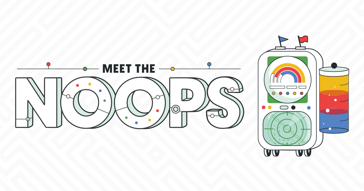
GitHub Summer Code Challenge
A colorful animated journey into summer-learning code challenges.
Creative Role: Art Director, Illustrator, Lead Animator
In 2019 GitHub needed a concept to engage young developers (high school & undergrad) out of school for summer break. They asked us at Lightboard (Agency) to develop a look-and-feel as well as a program designed with this audience in mind. I worked with my agency CD & CTO to develop this playful, animated program & marketing campaign based on the idea of nonsense machines, or “Noops.”
This project saw broad engagement on the GitHub community and had a full social presence throughout the multi-week event. The challenges remain live onsite today.
The machines & the process
Inspired by old technology and analog parts, we sketched, vectorized, and animated our nonsense machines in sprints. To hit ambitious timelines, each week we finalized 3-5 new bots. I lead the sketching, concepting, and did much of the animation (Lottie compatible, made in AfterEffects).
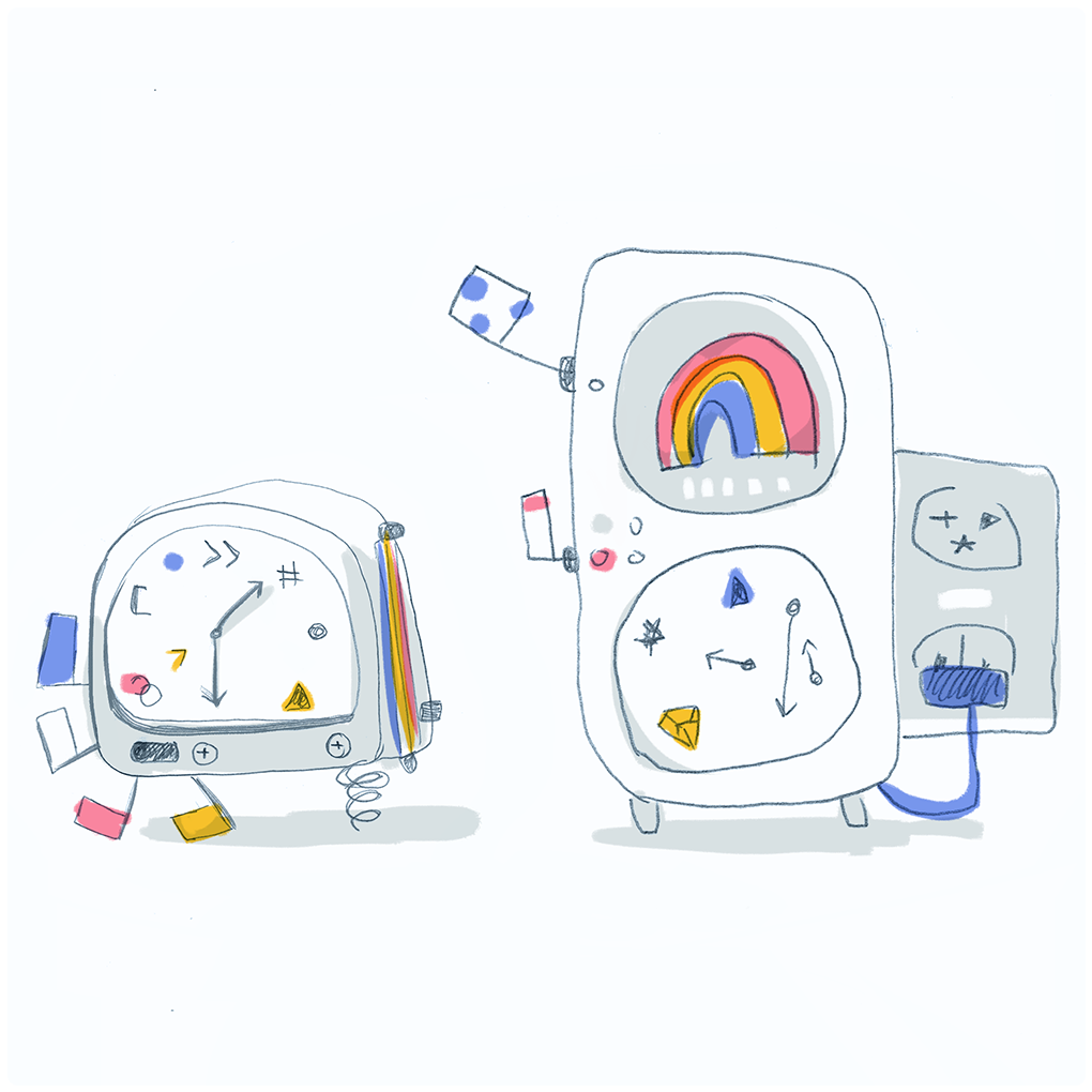
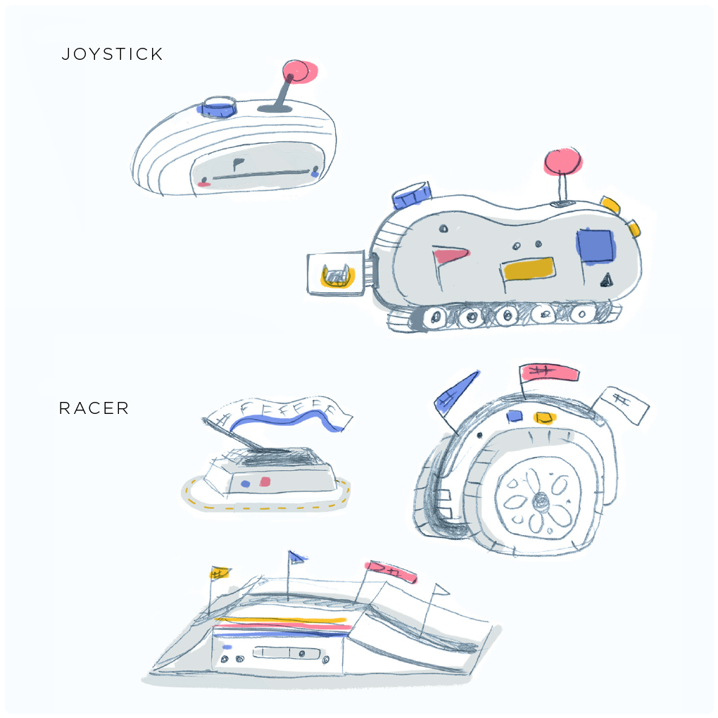
Supporting creative direction from internal & client directors, analog “nonsense machines” were developed from inspiration drawn from clocks, drum kits, and lab devices.
Final Noops
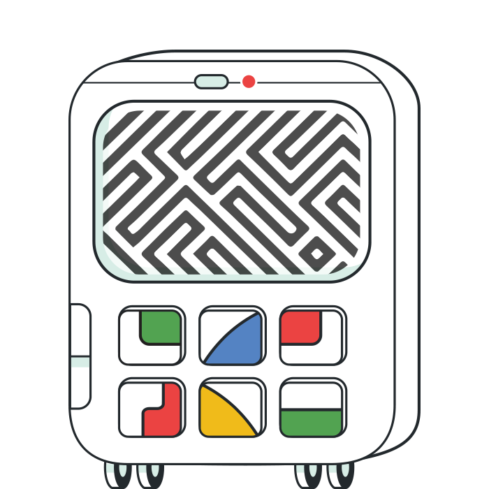
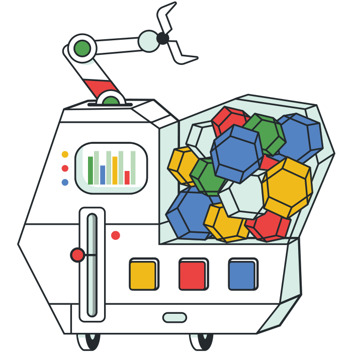
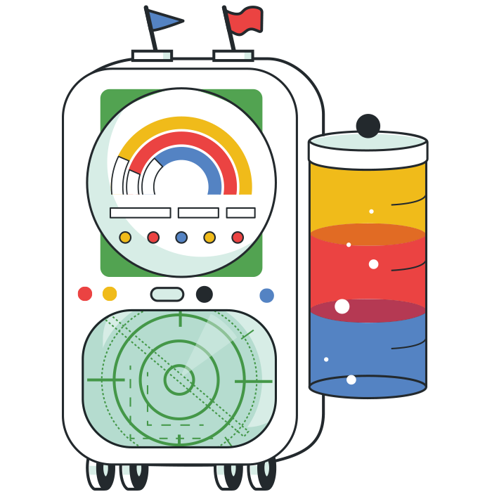
Our final Noops were a variety of shapes and sizes, all designed to be part of the same visual family. Each matched the theme of the code challenge it was associated with—a Hex-bot with an ink tank created for our Hex Code Challenge, a Compass-bot for our challenge for our Direction Key Challenge, and so on.
Complexity
From left to right are Noops from Week 1, 2, and 3. As the summer event progressed the difficulty of the code challenge increased: so too did the complexity of the illustrations. Larger or more representative body types as well more features were given to Noops later in the series.

Animation
We created a smooth and indefinitely-looping animation style for all Noops. Shapes and animations became more sophisticated as the challenge weeks progressed. Two examples of later-week bots include our Chat-bot and Music-bot, which had larger body-types and more animation points.
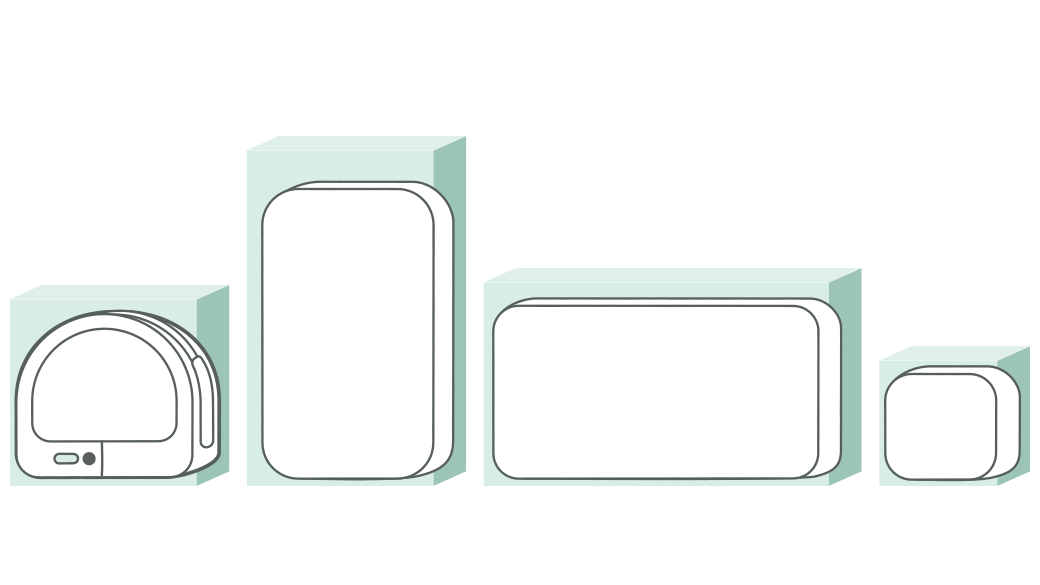
Illustration structures …
We chose to create illustration boundaries to make a cohesive family of robots. These included guidelines for body types, button depths, and color palette to keep our work consistent. Our timeline required us to design, illustrate, and animate in a rolling series: Week 1 would be in final animation at the same time that Week 3 would be in sketch/concept phase. The choice to set these guardrails up front allowed us to hit the tight timelines of this project.
… and digital experiences
We designed interface elements to create a custom experience for those participating in the Noops challenges. These included helpful trigger bots (reminding people to link their account) progress bars, badges, and user badge frames.


Conclusion
This Summer Code Challenge event engaged Github users in a colorful and cohesive journey. Creative play and structure came together to make this project successful. By detailing the process and outcomes here, I hope to help non-illustrators understand how larger bodies of illustration require guardrails for success, and aren’t created from spontaneous creativity or brainstorming alone.

