MakerSights Case Studies
Modern industry reports for digital distribution.
Creative Role: Lead Designer
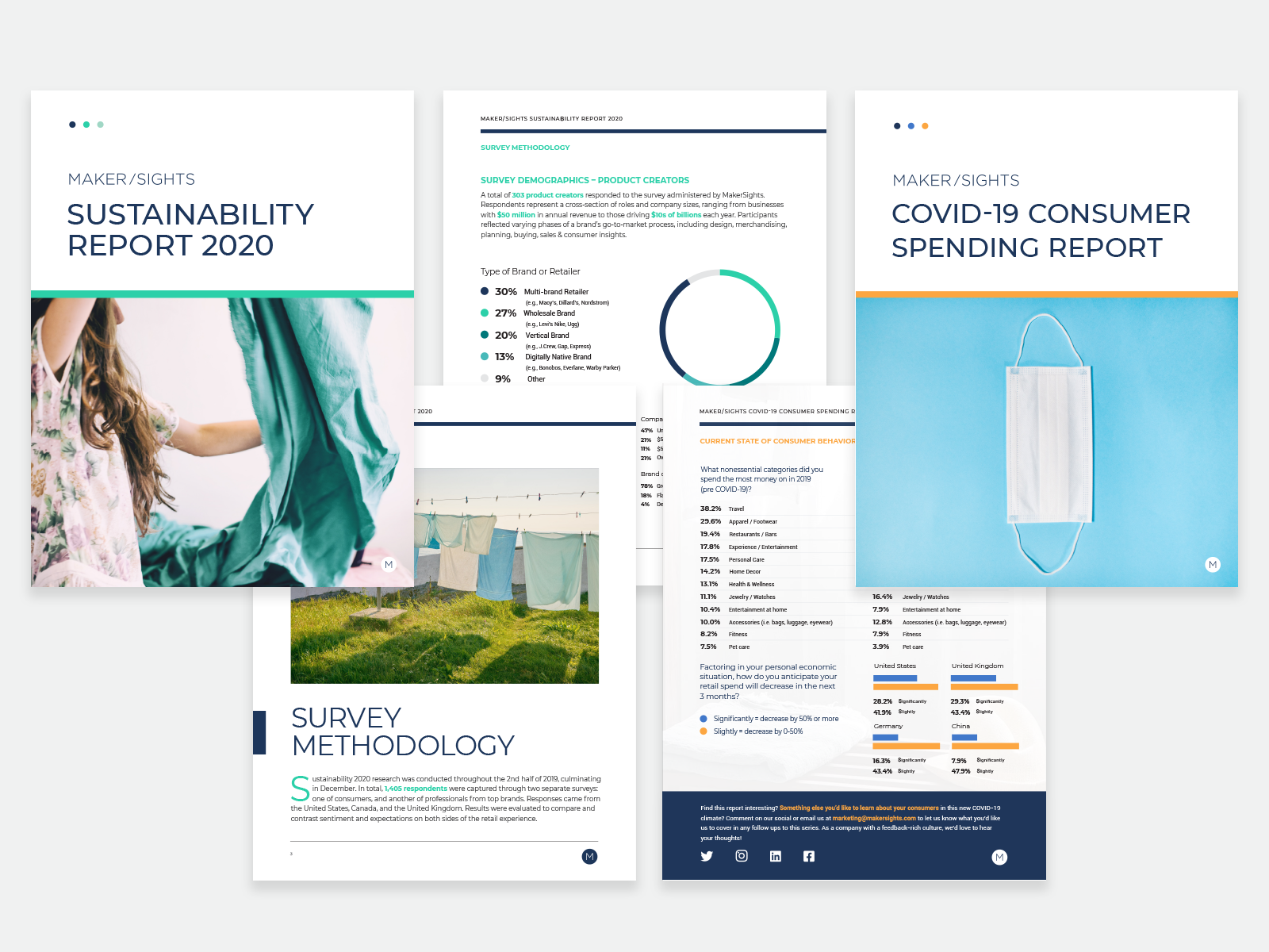
In 2020 I worked with the MakerSights team through an agency to create these two reports to re-define, simplify, and modernize the graphic treatments used in their case studies.

Sustainability 2020 Report
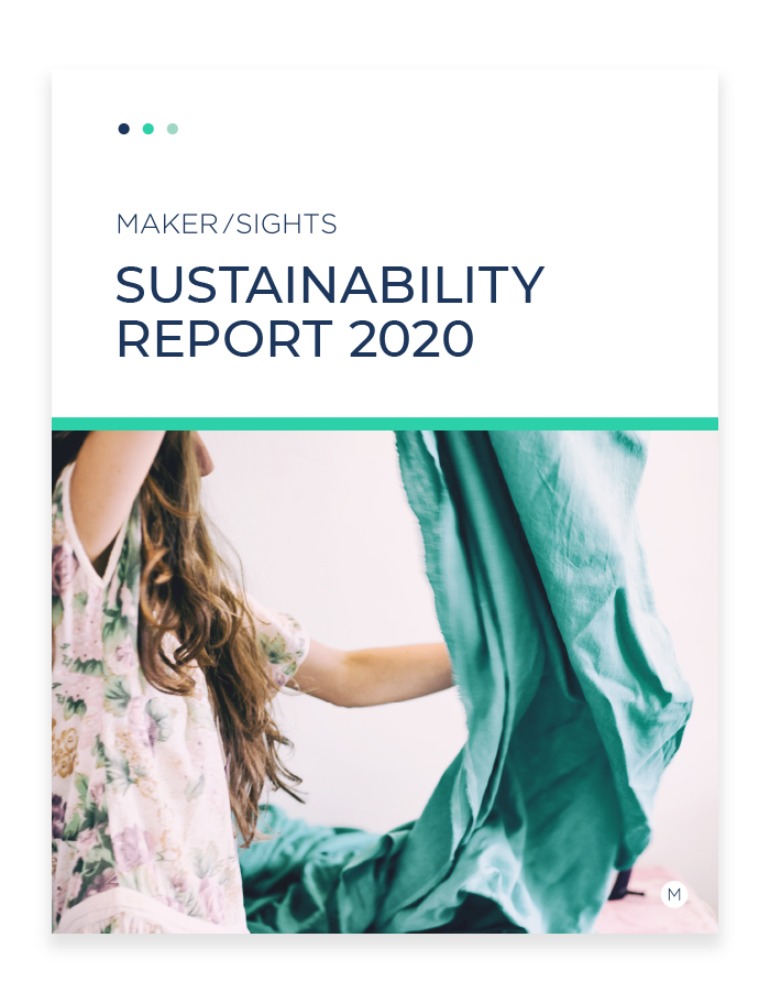
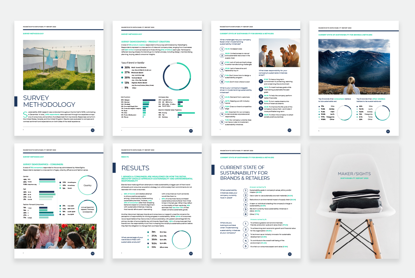
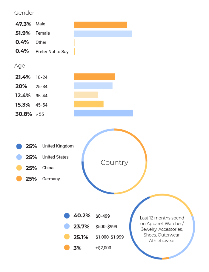
In this annual report on sustainability, we were asked to develop a lightweight and easily readable approach to charts and graphs. Prior reports had struggled with unity in copy, data, and visuals. Our data supporting design avoids heavy color blocking or solid graphs where possible.
For color, we incorporated the MakerSights brand navy and built a friendly ‘blue dominant’ palette with greens added for this report’s theme. Photography was curated to feature both fashion and nature, and create a cohesive palette (favoring blue skies and plant life).
COVID-19 Consumer Trend Report
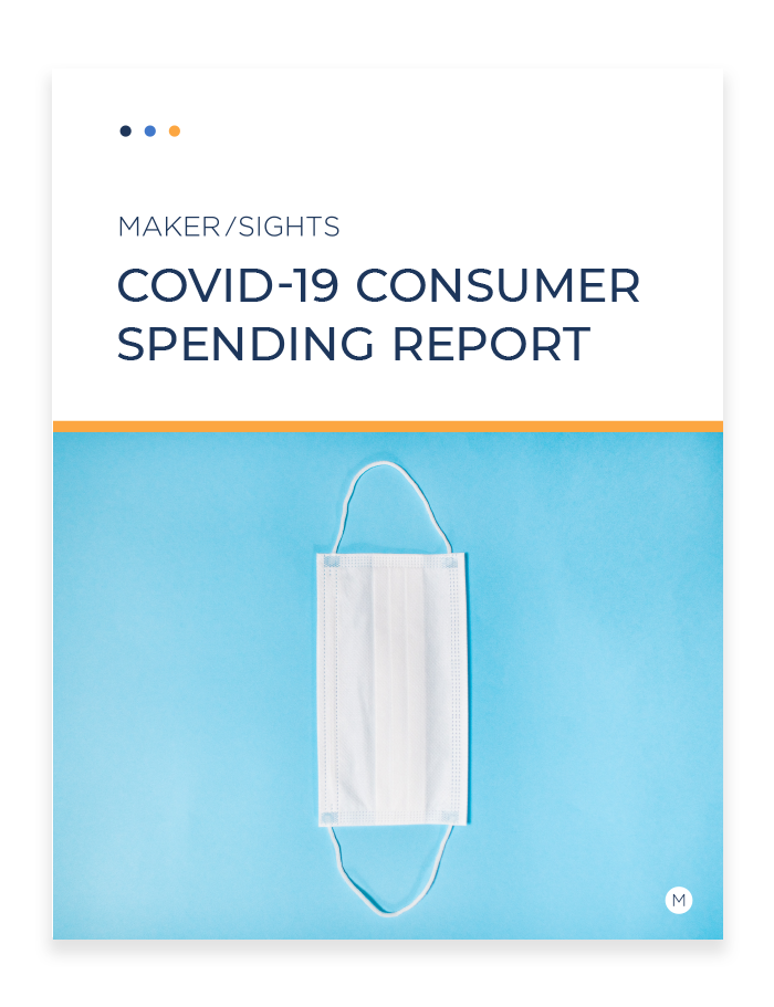
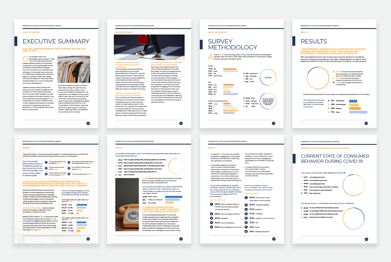
Having established the look-and-feel for MakerSights case studies in the Sustainability Report, we continued to our next project: a COVID-19 trend report. The addition of new colors within the established ‘dominant blues’ palette allowed each report to stand out while being part of the same family (think siblings, not twins). Bright oranges were selected to command attention but in a non-alarming way: a fine line for the topic at hand.

Conclusion
Usable and beautiful data visuals allow MakerSights to connect with their customers. This project created two reports, and also established a style guide for a more readable and on-brand experience in future reports. In addition to their role in informing and educating, these reports have had the perk of supporting MakerSights social media content. Each graph can be easily re-purposed for Twitter, Facebook, or Linkedin.

