
Wheels of Fortune Showcase
Non-Profit Event Design
Role: Designer & Illustrator (2018-2021)
Teammates: Steph Jurek, Designer + Illustrator (2019), Alexandra Pepin, Designer + Photographer (2019)
Wheels of Fortune (WOF) is a showcase of women, trans, and non-binary skateboarders. Skaters from across the world attend this annual event based in Seattle. It is held by the non-profit organization, Skate Like A Girl, which operates 3 coastal chapters focused on youth empowerment through skateboarding in Seattle, Portland, and the Bay Area.
The branding and style of this growing event was been developed and pushed by designers within the community who volunteer their time. This is a showcase of my work on WOF between 2018-2020, and the work I created alongside teammates Steph Jurek and Alexandra Pepin in 2019.
Refreshing a beloved hand-drawn logo
One of the first tasks I took on for elevating WOF was refreshing the logo. The committee members didn’t want to leave the old hand-drawn logo behind, but they needed to update the event logo to look great alongside the larger sponsors the event had grown into.
To respectfully approach this, I cleaned up and traced over the original logo in vector, then developed iterations. Some versions were closer to the original and others more exploratory. After feedback from WOF leadership & the planning committee, a final design emerged.
Preserving a hand-drawn edge in the vector.
Logo Concept / Evolution Ideation
But what does the logo “mean”?
The final refreshed logo is the shape of a skateboard wheel like it’s predecessor, but not everyone viewed the original logo as a wheel at all. Some people saw it as a firework, while others thought the anchor-like shape in the middle was a nod to the coastal Seattle home-base.
We didn’t need to reconcile these different interpretations, but to make a logo everyone was happy with meant having conversations. Through dialogue facilitated by design, we were able to make decisions about what could be and what should be. We kept the wheel central since skateboarding is the core of the community, and the handwriting remains hand-done to reflect Skate Like A Girl’s youth focus. All graphic treatments with the logo preserved the organic edges to keep the DIY look.
Established and well-loved logos like this are both fun and challenging to work with.
Final Logo
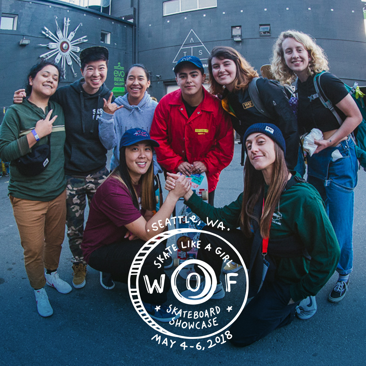
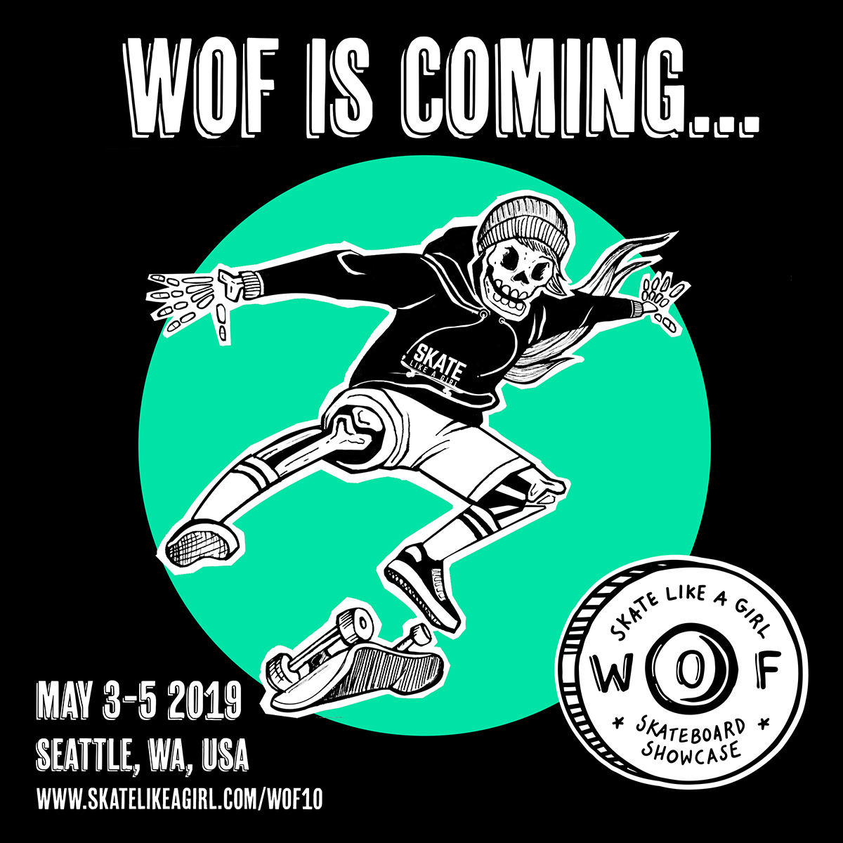
Logo in action for 2018 and 2019
Event map illustration
To aid international attendees, an illustrated map was created to help identify key event locations + skate spots. The first year I created an event map was in 2018, and I have updated it for every event since.
Process highlight
To create this map, I was given a list of spaces from the event planner that we needed to highlight.
For version 1, I charted these on a map of Seattle by hand and scanned in the mark-up.
For a monochromatic version 2, I moved into Adobe Photoshop, the program where I am most comfortable illustrating. A clean, vector look wouldn’t be right for a Skate event, so I avoided vector based illustration here.
As final updates to lodging and skate spots were being applied throughout, I applied full color to a version 3: getting a proof on location-accuracy from those who had been skating Seattle longer than myself.


Skate Witches — Witch Hunt
A big weekend event the map is used for is The Witch Hunt. The Witch Hunt is one of the most anticipated events of WOF, being a citywide skateboarding team scavenger hunt. For a peek into the Witch Hunt events, see the above video featuring Seattle Rattle (The team I was a part of in 2018—created through the event, and compiled + edited by videographer and teammate Alexis Wolff).

Skeletons & Aliens
For it’s 10th Anniversary, WOF got a special logo-mark (Elise Loeb) and featured shredding skeletons (Steph Jurek). With photography (Alexandra Pepin), custom skateboards, and a dedicated marketing team on the WOF Planning Committee, WOFX work was the most extensive yet.


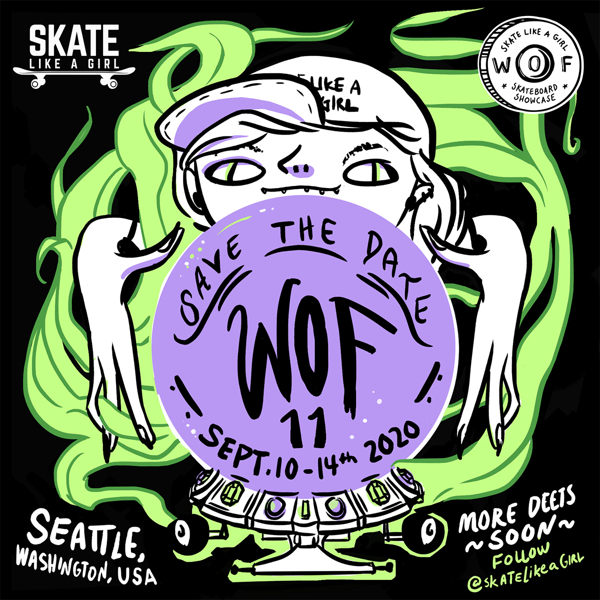
2020 and onward…
After the creation of the Save the Date artwork for WOF 11 (pictured to the left), the event was delayed due to the COVID-19 pandemic. Due to location changes and team shifts, I did not participate in the committee as they resumed event planning post-pandemic.
The design and illustration I’ve created with/for my Seattle skate community remains some of my favorite work. None of this would be possible without the foundational and ongoing work of Kristin Ebeling, Executive Director of Skate Like A Girl.